Pasargad Aviation Center
Brand Re-Design
loading
© 2026 Srava Design
Pasargad Aviation Center Brand Re-Design Category Graphic Design Date Oct , 2016 Client Pasargad Aviation Training...
Brand Re-Design
Category Graphic Design
Date Oct , 2016
Client Pasargad Aviation Training Center
Passargad is a flight school.It was established in 20215 as the first ground school and later became known as the Flying Club.
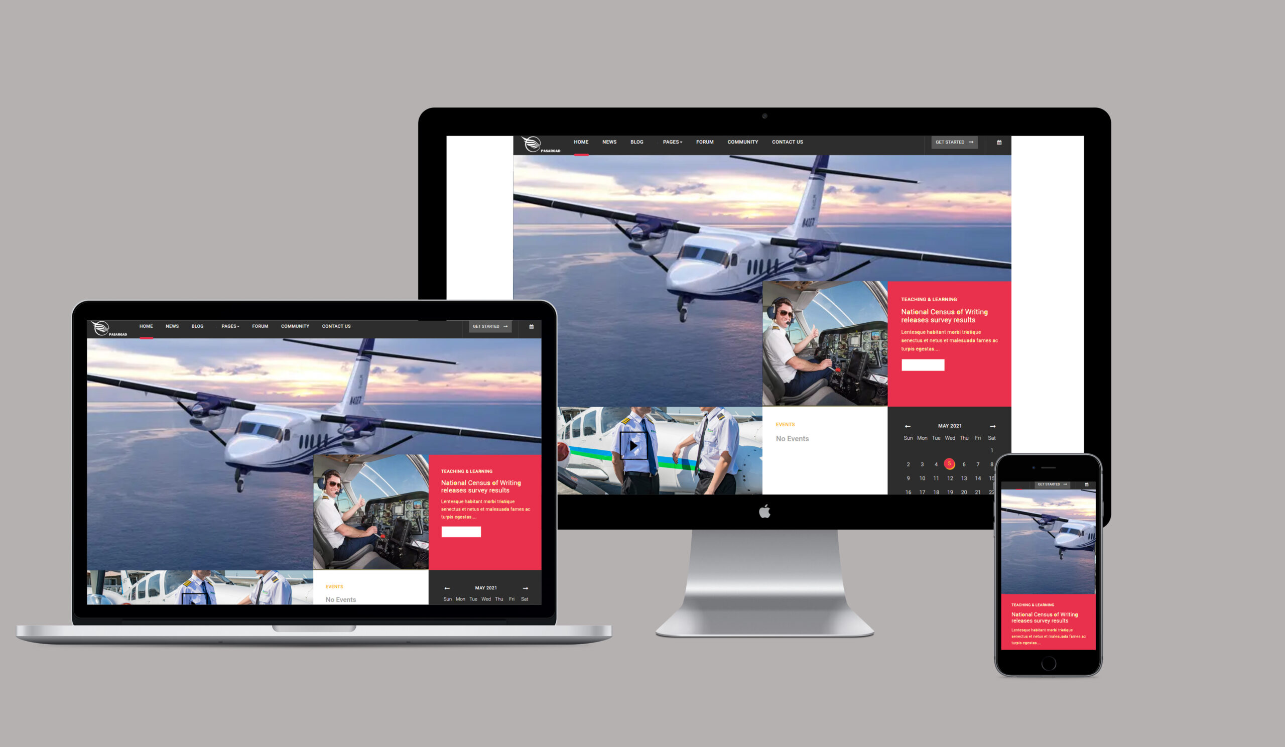
To re- design current brand and create a modern looking design that targets the younger audience.Also create a recognizable brand identity colours that reminds user of them anywhere.
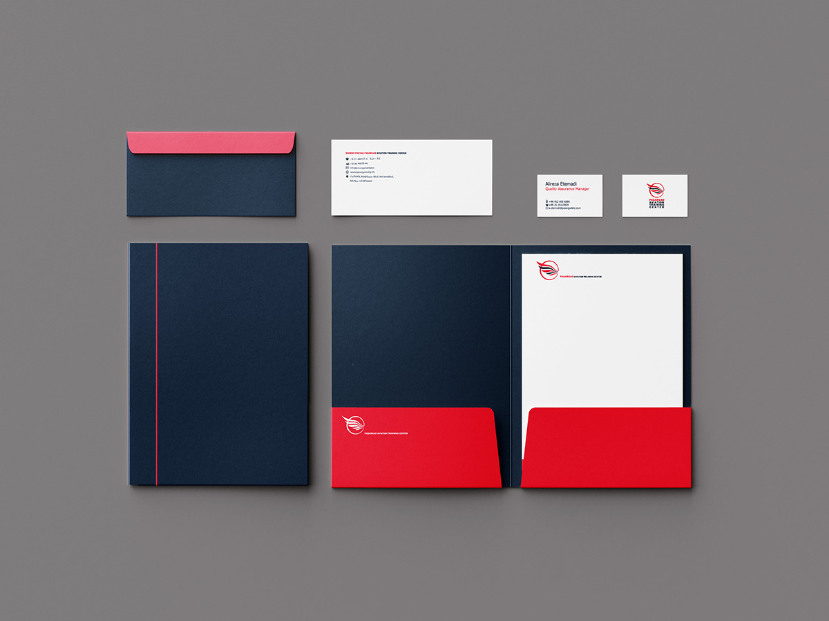
To retain the brand royalty colours.
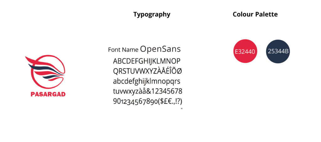
For the typography , I used Open Sans that is a humanist sans serif typeface. Open Sans was optimized for print, web, and mobile interfaces, and has excellent legibility characteristics in its letter forms.
Best used for: Websites and Mobile Apps for prolonged usage and legibility.
Open Sans is easy on eyes and can be good for regular consumption. A great use of Open Sans is in Body Copy or Navigation elements
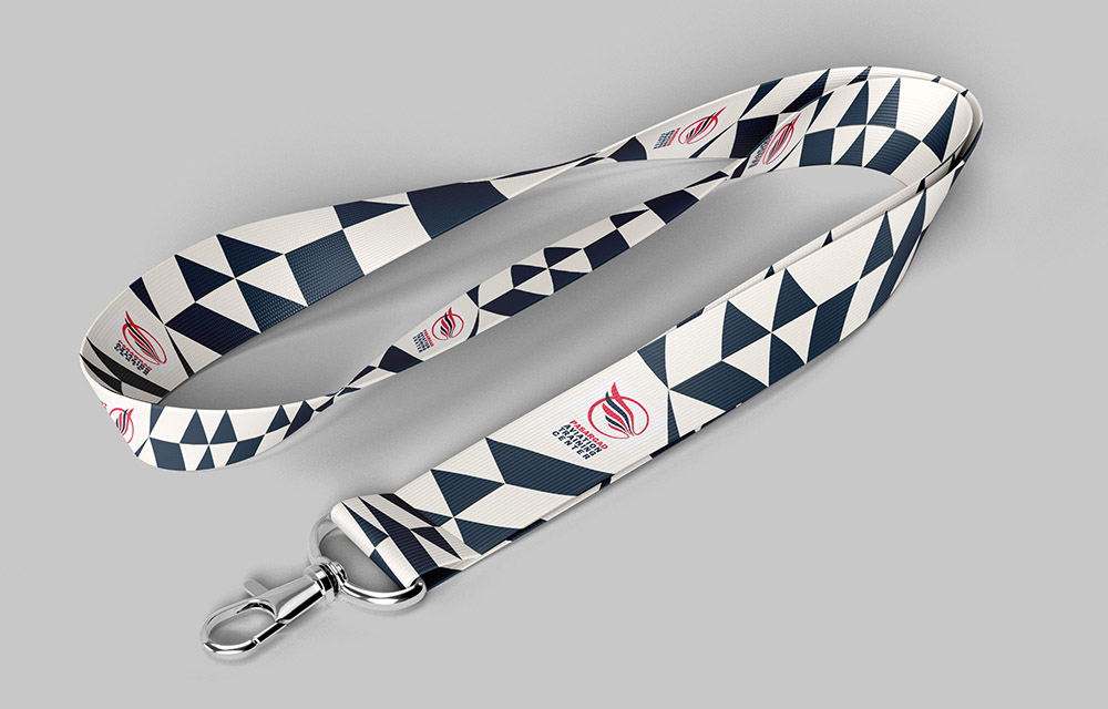
As for the colour palette,Given the fact that this design is related to the aviation industry, I used the composition of blue and red, which is the first brand’s colour signs.
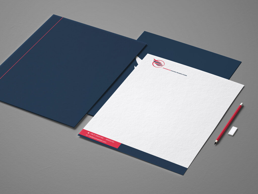

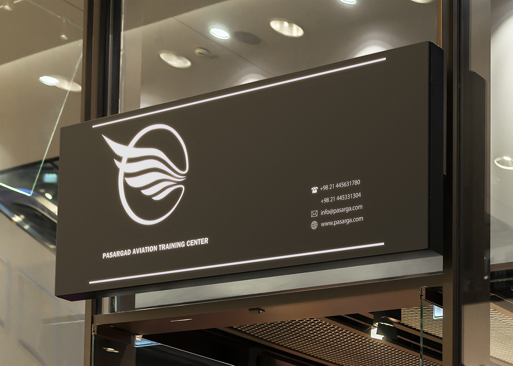
Office Board